


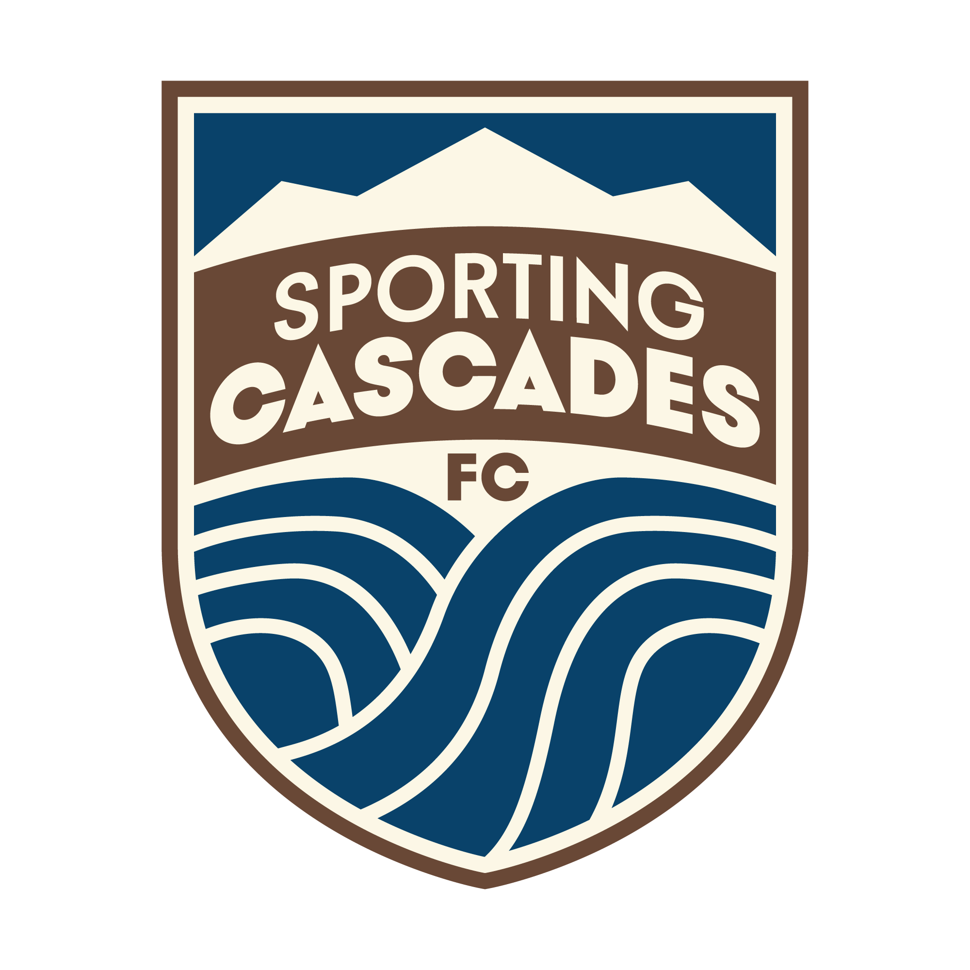
Our Crest
The Sporting Cascades FC crest is a bold, modern shield that captures the power, rhythm, and natural beauty of the Pacific Northwest.
Mountains meet the Sky
At the top of the crest, stylized peaks of the Three Sisters rise sharply, symbolizing strength and the aspiration of peaks forged by hidden fires beneath.
This element grounds the club firmly in its geographic identity.

Sporting Cascades Banner
The name “Sporting Cascades” is centered across the upper third in bold, geometric sans-serif typography on a banner which reflects structure and unity.
Two Rivers United
Beneath the banner, a dynamic series of flowing water lines reflect the McKenzie and Willamette rivers.
These lines represent the confluence of our beloved local rivers — a visual metaphor for movement, resilience, and community coming together. Their energy reflects the style of play the club aspires to: fast, fluid, and relentless.
Primary Colors
Our primary color palette draws directly from the natural landscape of the Pacific Northwest — mountains, rivers, soil, and light — to create a rich and grounded visual identity that’s both bold and organic.
Deep Cascade Blue
A strong, saturated blue that captures the depth of alpine lakes and shadowed rivers. This rich color, symbolizes trust, professionalism, and the relentless flow of sport.
River Valley Brown
This earthy brown anchors the brand in place — evoking soil, bark, and stone. It speaks to roots, labor, and the club’s connection to the land and its people.
Golden Light
A warm, muted yellow that softens the palette with the glow of dry grass and morning light. It adds warmth and accessibility to balance the bolder tones.
Maple White
A pale cream reminiscent of the maple wood of cascade forests and sunlit fog. This light neutral color provides contrast and space — a breathable backdrop and a welcoming unifying color.
Secondary Colors
Our secondary palette is designed to complement the core earth-and-water tones of the primary identity. It introduces contrast, energy, and modern flexibility.
Obsidian Black
A deep, cool black with a rugged, matte finish. Used for typography, contrast elements, and bold outlines. Evokes the look of wet volcanic rock and adds structure to any layout.
Basalt Gray
A weathered, slate-gray tone that references rock faces and overcast skies. Excellent for secondary typography, backgrounds, and apparel applications.
Lava Red
A bold, bright red used sparingly for emphasis — representing passion, urgency, and evoking of origin stories. Ideal for limited accents, callouts, and campaign slogans.
Forest Service Green
A refreshing, mint-green hue inspired by the equipment used in stewardship. This adds fresh yet nostalgic twist when used in alternate gear, community activations, or digital interfaces.
Alpine Blue
Alpine Sky is a crisp pale blue that evokes the morning light above the Cascades or the excited waters of river rapids. It can provide a sense of calm and elevation or energy and excitement depending on its accompanying palette tones.
Pure White
A clean, versatile white that provides essential contrast and space across all applications. Often paired with navy, brown, or red to maximize impact.